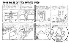
So here we have another in the True Tales Of Ted series. I tried a few new things this week, most noticably, lettering it by hand. Boy, was that ever a mistake. My handwriting sucks. Anyway, I did enjoy using the rolling ruler to lay out the lettering guides. I used a Pitt ink pen to do the lettering and the borders. I really like Pitt's brush pen, but their other pens annoy me when it comes to doing anything long, like lettering or borders--the tip just doesn't agree with me; too rounded. The ink also doesn't flow for long enough, and it's not nearly as eraser-proof as real India ink.
I also put in more background items this week. I've noticed my stuff looks pretty empty, and felt it needed more detail. There's still a big empty space in panel six, but the rest turned out pretty good.
I was particularly happy with the circular panel at the end, and the "info graphics" action items there and in the previous panel. I thought my clothes and Ray's clothes came out well; I could've put some folds in Brian's though. And I like my one-point perspective bricks in the next-to-last panel. I probably should've put the start of the count-off in panel 5 ("1,2, 3...") in a balloon coming off the main balloon, for more drama.
I also did this on a much bigger piece of Bristol. I usually use 9x12, but this piece was 17"x22". I wanted to try a bigger piece so I could get more detail in there. Turned out to be a bitch to scan, but it was worth it. I also got to use my grandfather's T-square to lay out the panels.
The full picture is here.
The thumbnails for the piece can be seen here.
Some of the preliminary sketches are right here.
As always, Kit's ISIDTA for this week can be found here.
My other ISIDTAs are located here.
Tune in next week for more comics, hopefully showing a little progress in my artistic endeavours!
Wednesday, January 17, 2007
Subscribe to:
Post Comments (Atom)

3 comments:
I think that the comic might need just one more panel after the circle, some sort of denouement or other. A life lesson learned, some friends become enemies, some enemies become friends, you know, something like that?
I love the forced perspective on the dotted line. I suck at forced perspective. Remind me to show you some of my more thought-through attempts at it so you'll understand why I avoid it so stoutly.
Also, Poor young Sketch; he's the only one in the comic who doesn't get to smile.
Kit, I think you're right about the need for a denouement bit, probably something along the lines of the below-the-panel bit from the last panel of ISIDTA 8. Let's pretend I clever wrote "My friends never really like each other" across the bottom curve of the circular panel.
One-point perspective (the type I used in drawing the wall) is actually really easy. (Well, when you're drawing nice prismatic solids like a brick wall. It would've been even easier if I had thought to use my cool rolling ruler (which I did use to do the lettering, not that it shows.)Drawing the distant running Ray to fit the angle and perspective, however, required many, many preliminary sketches.
Young Sketch never smiled a lot.
Post a Comment